It’s 2024, so online shoppers not only look for—but also expect—a seamless shopping experience regardless of what device they’re using. A shoddy mobile experience may strongly influence whether a customer shops with a brand again, online or brick-and-mortar. This is a key reason why we take a very close look at mobile optimization to improve eCommerce user experiences across mobile devices.
Conversion Rate Optimization: Insights from a Single A/B Test
While there are many website testing methods for conversion rate optimization (CRO), an A/B test (aka split website test) is considered the baseline. During an A/B test, website traffic is allocated and distributed between the control and the variation of that test. Having a consistent website experience across all devices is important, and understanding and pivoting that experience to a buyer’s behavior is even more crucial to ensuring your customer 1) buys from you and 2) continues to buy from you. This is why it’s so important to focus on optimizing the shopping experience on mobile.
How to Do A/B Testing: Our Recommended Tool of the Trade
There are numerous tools you can use to run an A/B test on a website. But, we prefer to use the experimentation tool Convert. Convert is our testing tool of choice because it provides enterprise-level testing features with affordable, up-front pricing that is reasonable for our mid-market eCommerce customer base.

Usability Tests on Mobile: A Real-Life Example
Let’s use an A/B test we ran on one of our customer’s websites to further illustrate its importance. This Omnitail customer in the sports apparel industry came to us with the following problem:
Because the site’s top-level menu items were not tappable (clickable), they believed their website navigation was not optimized for a true mobile user experience (UX). They also wanted to know if this same UX issue caused product pageviews to decrease.
From the customer’s point of view, they believed these problems were causing shopper frustration and thus creating friction in converting sales on mobile devices. As a mobile-first approach continues to be the norm for many shoppers, mobile optimization is necessary for online retailers.
How We Approached Solving these Problems
A single A/B test we ran on this customer’s website helped them better understand how buyer behavior on mobile devices impacted their bottom line. The test? Comparing buyer behavior on the current UX with a variation where the top-level menu items were made tappable, to see if the variation would improve their site’s overall conversion rate and pageviews.
To execute this test, we expanded one section of the mobile navigation menu by default, so that tappable (clickable) child pages were immediately accessible to the shopper when browsing through the site. Before testing this change, we also noted these different areas of concern:
- Primary area: Menu link clicks
- Primary area: Order conversion rate
- Secondary area: Product pageviews
- Secondary area: Add-to-cart rate
- Secondary area: Revenue per visitor (RPV)
Mobile Optimization: What We Observed from the Test
We executed this experiment over a period of 28 days. Since this was an A/B test, there were two variants totaling a sample size of 449,228. From this sample size, we ended up with 13,015 total conversions. After running the test, we observed the following:
In this experiment, expanding by default one category of first-level child pages in the mobile menu caused:
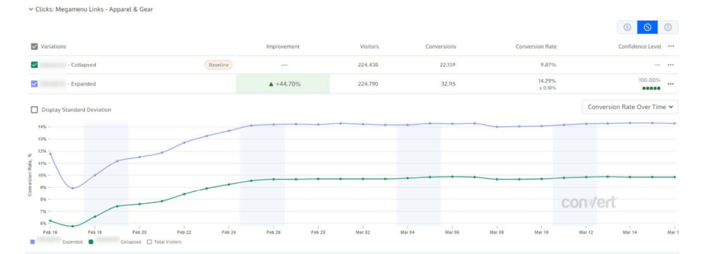
- +44.70% increase in menu clicks
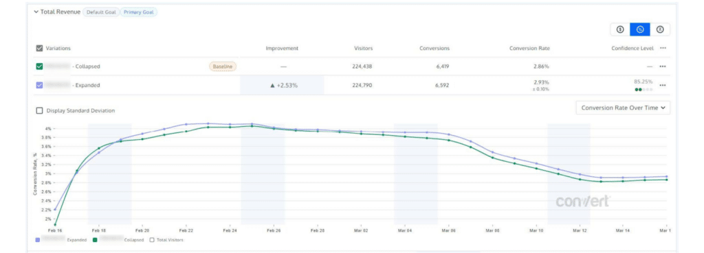
- +2.53% increase in order conversions
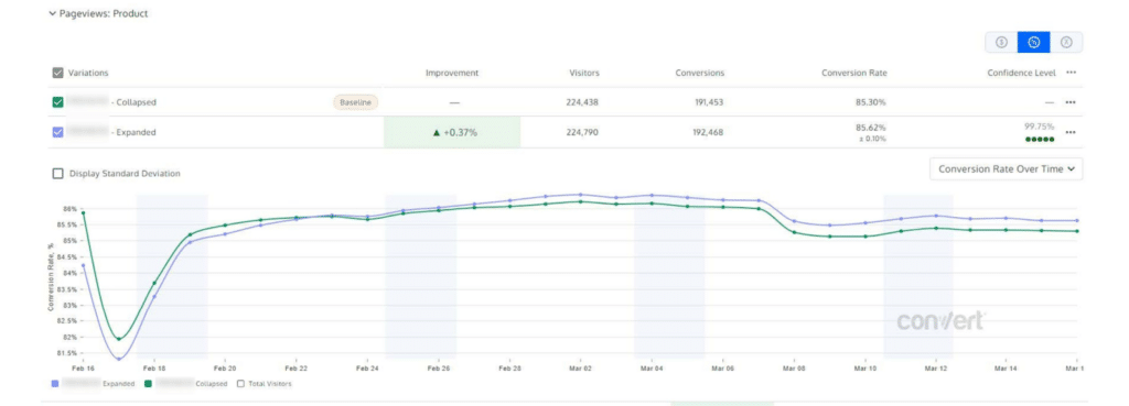
- +0.37% increase in product pageviews
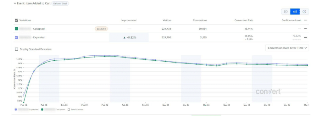
- +0.82% increase in add-to-cart rate
- +1.80% increase in RPV
Test Execution
- Test Tool: Convert
- Run Duration: 28 days
- Number of Variants: 2 (A/B)
- Total Sample Size: 449,228
- Visitors per Variant:
- A: 224,438
- B: 224,790
- Total Conversions: 13,015
- Conversions per Variant:
- A: 6,419
- B: 6,592
Given that we observed all tracked metrics to be positive, and primary goals showed high confidence, it can be inferred that expanding this customer’s mobile menu by default draws significant additional attention to the expanded category. However, with the current design of their mobile navigation menu, only one top-level category can be expanded at a time, which may end up cannibalizing and/or suppressing traffic to non-expanded categories.
After analyzing the Convert reports, we observed that expanding the first-level child pages by default in the mobile navigation menu did increase order conversions on their website. We also observed an increase in click-throughs to those product child pages as an additional result of this experiment.
Report Analyses
Goal Graphs

Our Recommendations Based on the Results
Because the results were positive, we recommended to expand the mobile navigation menu by default and run additional experiments against other hypotheses to further understand what other mobile optimizations will meet or exceed our customer’s business goals. Based on these test results, we hypothesized that expanding a mobile navigation menu by default should draw significant additional attention to the expanded category.
While the results of this experiment were conclusively positive, we still recommended that our customer implement the change, but not permanently because of the possibility of cannibalizing and/or suppressing traffic to non-expanded categories due to the current web design limitations. Additionally, we recommended our customer use the experiment findings as insights for driving traffic to a product category they want to emphasize for a specific reason, such as a sale, season, or other event.
We also gave UX design recommendations to our customer, so they understand that the mobile navigation does not need to be permanently static; menu items can be rearranged, added, and/or removed depending on their business goals.
The Omnitail Difference: Conversion Rate Optimization Services
Omnitail is disrupting the digital marketing landscape with our unique profit-driven approach to eCommerce marketing. But consistent, annual growth requires your eCommerce business to continuously improve on these three metrics: Increase traffic, improve monetization, and boost margins.
Lucky for you, we’re a marketing agency focused on getting all three of these back on track for you. We increase traffic by sending the right traffic at the right time using our profit-driven performance marketing strategies. We improve monetization by continuously researching, designing, and testing to give you clear instructions on how to elevate your campaigns’ conversion rates. And we boost margins by accounting for the metrics that ad platforms usually miss: COGS, variable overhead, returns and cancellations, and more.
Reaching out to our team is the best way to ensure you’re doing the right research, running the right tests, and making the right campaign optimizations that provide value and improve your bottom line. Learn what works before you commit by contacting our team today to learn more.

